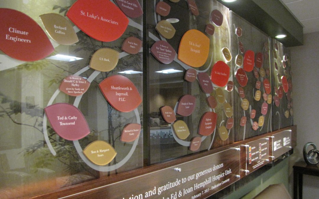
A creative twist on the traditional donor tree
Presentations’ custom design for the Hospital Hospice Care adds a soft and natural look to the space. Working seamlessly with the hospital team, the donor display brings to life the artful vision of this magical donor recognition wall.
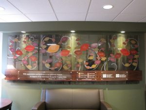 At first glance, you’re drawn into the beauty of the donor wall by the soothing earth tones of the individually cut donor leaves, and the whimsy of the etched swirling branches that seem to carry the donor leaves and flow through the air into the serene forest.
The donor tree is a perfect for the small space, which is at the entrance to the hospice unit, and a gathering area for visitors and families, but it also needed to tie into and add an artistic tone. It was only fitting, that the theme of the donor recognition wall, and inpatient hospice unit, embrace the seasons of life and change. 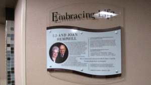
The donor tree leaves and back panels are made of translucent photo panels. Etched line art was added to each panel for a whimsical feeling and wood was used to tie it all together. Presentations went a step further and carried these materials throughout the hospice unit with nearly 20 room naming signs made of these same materials. Special hardware was used to ensure security throughout the busy hospital. Additionally, the key donor was recognized in a separate plaque telling their donor story and honoring their donation to the new Hospice Care facility. 
Our ongoing relationship with UnityPoint Healthcare has resulted in an array of visual displays throughout their network of hospitals, clinics and care centers. Our team works closely with the healthcare, marketing and foundation to create custom history displays, digital and static donor recognition, digital marketing, and wayfinding to fit each unique space, budget and mission.
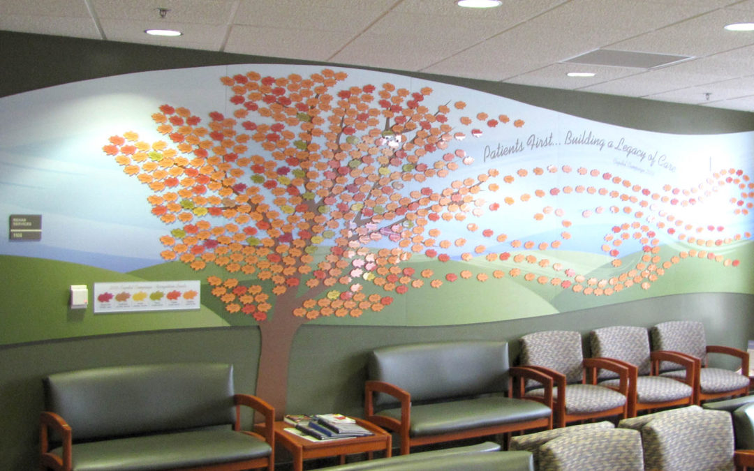
Leaf Donor Wall Custom Designed for the Space
The hospital leaf donor wall celebrates the many donors that make the new health facility possible. Working together, Our team of designers and engineers envisioned the new lobby space and guarantee a location for the donor display prior to the building completion. The conceptual phase of the donor wall project involves understanding the Center, their mission, their goals, and all aspects to include within the leaf donor wall. After a walk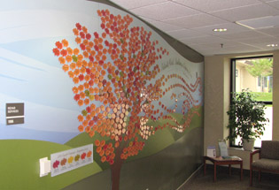 through of the center it was decided the best place for impact and viewing would be on the large 20 foot lobby wall. The design challenges to include 610 donor names within 6 giving levels, fit the space and create an art piece that relates to the Center.
The final design is a simplified, airy tree with blowing leaves dancing in the spirit of the project. The addition of the quote, “Patients First . . . Building a Legacy of Care.” clearly explains the mission. The leaf donor wall is mounted to a printed background to represent the rolling hillside landscape of the area and completely covers the dark green wall. The abstract curved shape to the panels helps soften the clinical feel to the waiting room. The main fall orange tree color compliments the green interior, walls and furniture to evoke emotion. Individually produced acrylic leafs make up the many donors and is color coordinated to its giving level To complete the display, a printed legend explains the giving levels.
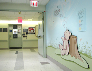
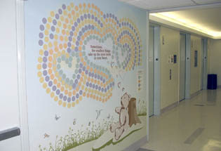 The Smallest Things Donor Recognition Wall celebrates and honors those small miracles who come into the world at Roosevelt Hospital in Mahattan, NYC. The idea is to include Parents, grandparents, family and friends who may wish to mark this joyous and exciting time in a very special way. With a charitable gift the baby in their life will have their name displayed on the mural – a unique and lasting tribute that commemorates the beginning of one life by helping to ensure the care of future lives.
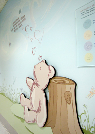

Inspiration for this recognition wall came from the idea that “Sometimes the smallest things take up the most room in your heart.” We took an illustrative direction to this donor wall to give it a playful children’s books feel which spoke to the audience of a birth center. We created an original illustration specifically designed to include all elements for donor recognition. One challenge was that because this is and ongoing campaign for years to come, how can we have a display that looks finished yet isn’t complete? So we designed two aspects to the recognition wall, a main illustrated scene and then an image that grows as donations are received. The overall image includes a bear sitting in the meadow surrounded by some of natures smallest animals which ties into the main quote. The bear and tree stump are individually cut out from the background and are mounted off the wall to create depth and interest. The bumblebee, butterfly, dragonfly and hummingbird are also the category names and color coordinated to match giving level circles in non gender specific pastel baby colors. As donations are received, a plexiglass circle with the baby’s name will be displayed onto the illustration with room for up to 450 donor names. The idea is that in the blue sky heart-shaped clouds fill with cheerful color as each newborn’s name is added – bringing the endearing scene to life.
On display is an original illustrative donor recognition wall honoring precious new arrivals and showcasing the commitment to newborn care and bringing hope to all who pass by for years to come.
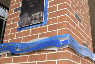
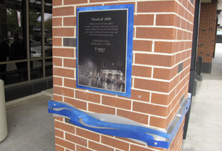 The outdoor donor recognition plaque recognizes the heroic efforts by Mercy Hospital during the flood of 2008. Located more than 10 blocks outside the flood zone. Mercy Medical Center was shocked to see the flood waters enter the ground level of their hospital. While volunteers, Mercy employees and contract workers held back the waters. Mercy employees succeeded in evacuating
 over 200 patients.
Mercy Hospital asked Presentations to create a flood line marker and plaque. Working with the Marketing team at Mercy Hospital we created a custom artistic wave like shape to represent the final Cedar River crest. And above this marker a plaque showcasing a photo of the event representing the determination of the people involved.
The concept involved wrapping all four sides of a square pillar next to the entry doors. We chose to use aluminum which matches the aluminum window frames and can hold up to being outdoors. Using a two layer design we had the aluminum custom cut and shaped to create a water like feel. Then we grinded texture and artistically painted one of the layers a metallic blue. To match the aluminum marker we created an aluminum plaque using a translucent film mounted to aluminum panels. The final result is a custom art piece that glimmers in the sun light – a beautiful reminder of human spirit during a devastating time.

 At first glance, you’re drawn into the beauty of the donor wall by the soothing earth tones of the individually cut donor leaves, and the whimsy of the etched swirling branches that seem to carry the donor leaves and flow through the air into the serene forest.


 through of the center it was decided the best place for impact and viewing would be on the large 20 foot lobby wall. The design challenges to include 610 donor names within 6 giving levels, fit the space and create an art piece that relates to the Center.
 The Smallest Things Donor Recognition Wall celebrates and honors those small miracles who come into the world at Roosevelt Hospital in Mahattan, NYC. The idea is to include Parents, grandparents, family and friends who may wish to mark this joyous and exciting time in a very special way. With a charitable gift the baby in their life will have their name displayed on the mural – a unique and lasting tribute that commemorates the beginning of one life by helping to ensure the care of future lives.

 The outdoor donor recognition plaque recognizes the heroic efforts by Mercy Hospital during the flood of 2008. Located more than 10 blocks outside the flood zone. Mercy Medical Center was shocked to see the flood waters enter the ground level of their hospital. While volunteers, Mercy employees and contract workers held back the waters. Mercy employees succeeded in evacuating