 A celebration of the many different donors and giving campaigns is reflected in the many different donor displays custom designed and fabricated by Presentations using their exclusive Rail Wall and Arreya Digital Signage products.
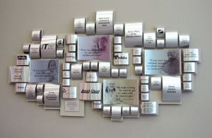 The capital campaign donor wall was constructed by rolling aluminum to emulate cans of food, into an abstract mosaic that graces the large, 2-story lobby. Translucent photos were printed on concave pieces of aluminum and corporate donor logos were added to some of the larger pieces of rolled aluminum.
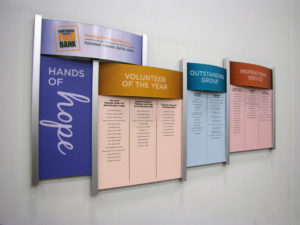
The 2 of the 3 other donor walls needed to be easily updated and Presentations, exclusive Rail Wall was the perfect choice. The Rail Wall donor walls are great for creating an updateable donor wall. New donor list panels are reprinted and slide in and out and the structure coordinates with the modern, industrial architecture of the space. The designs were developed and fabricated by Presentations to coordinate with the campaigns and differentiate between the annual giving campaigns and the capital campaign donor wall.
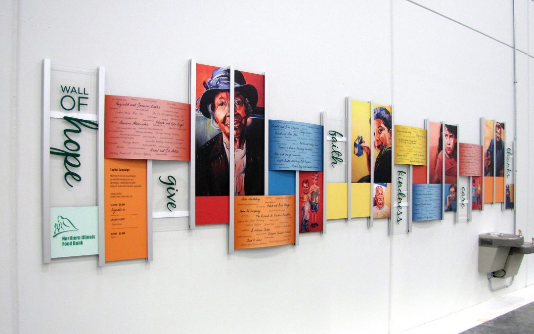
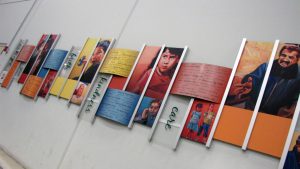 The Wall of Hope donor wall is inspiring with custom artwork. Using a local artists renderings and donor signatures to catch the attention of the many visitors, volunteers and corporate donors that help in the busy packing area of the facility.
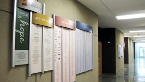
With the continued success of the facility, another Rail Wall was added to accommodate the many different types of donors. The design reflects the 2 other annual donor walls. The headers panels denote the different giving levels, while the panels are lists of the donors and corporate logos. Each year new panels are created to replace the old panels. Within minutes of installation donors were snapping photos of the new donor recognition display.
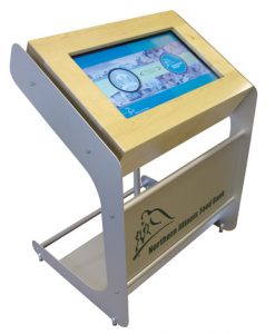 As an added bonus, an interactive kiosk greets visitors at the entrance to the facility. It gives information about the outreach programs and meets LEED requirements.


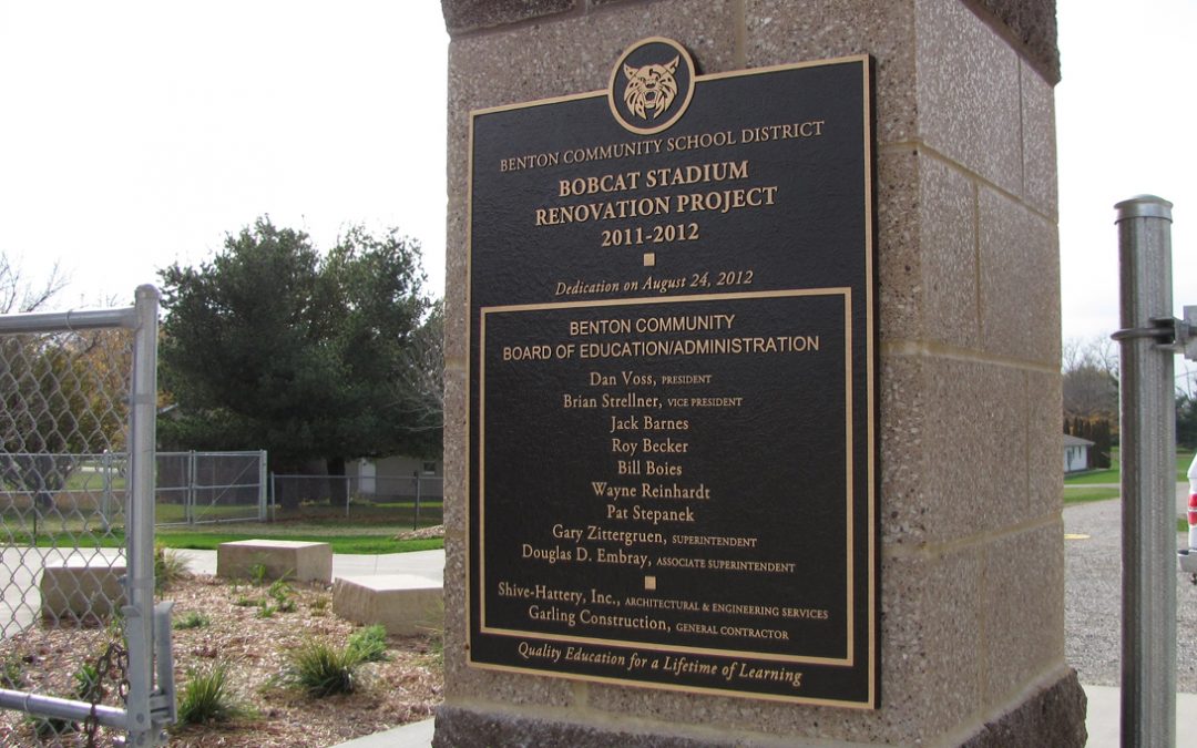
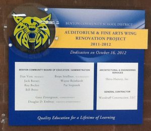
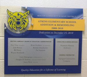
The Benton Community School District contacted Presentations to create three dedication plaques for various buildings. Gary Zittergruen, the Benton CSD Superintendent, spotted a plaque previously done by Presentations for the Cedar Rapids Community School District sparking his interest in a similar design.
Presentations created two dedication plaques based on the CRCSD design. Mounted on Plexiglas with standoffs to differentiate the mascot from the rest of the plaque, the addition of the school’s bobcat mascot to the donor plaques makes it distinctive to the school and adds dimension to the display.

Designed to stand up to the outdoor elements at the Bobcat Stadium, another plaque was fabricated from bronze for the Benton Community School District.
The biggest challenge for this project was getting a high enough resolution photo or vectored image of the mascot. It is beneficial to save the vectored images for any logos you may want to print later in order to retain image clarity. At the end of this project Presentations was able to provide Benton CSD with a high quality file of their bobcat mascot.
Benton Community School District can now show their pride with three beautiful dedication pieces.


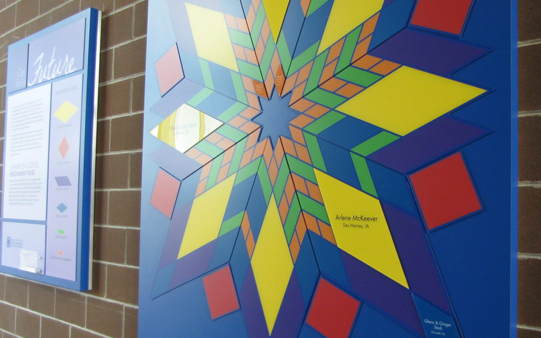
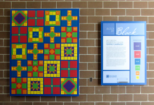
Inspiration for the updateable donor recognition displays comes from quilt patterned tiles located on the building’s exterior. With the donor recognition displays, they give reference to the local farm culture and the state of the art animal show arena in which the donations were given. The quilt display allows for various levels of recognition. The “Block by Block” donor display and it’s partner display “Champion’s Circle”, creates added interest in the campaign. Each wall underscores the importance of community giving. Currently the donor display is located inside the expansive hallway adjacent to the arena. Bright primary colors stand out against the grey and brown minimal space. Individual tiles are added every year as more donations come in. Due to the success of the ongoing campaign, a second donor quilt wall was created to accommodate the additional donors.
The different tile colors and size pieces on the quilt donor recognition display represent the different giving levels. For details about the campaign, a companion key accompanies each donor display. It tells the story of the campaign, shows the different giving levels and brochures are available for potential donors to take. Continually promoting and celebration the ongoing campaign for current and future donors.


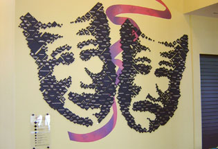
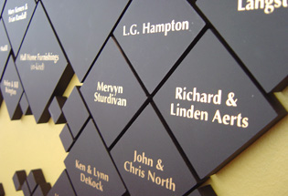
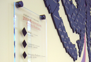
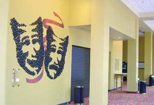
 Focusing on a renovation for the 100 year old theatre, the board wanted to update the existing, hard to read donor recognition panels and they wanted to include past and present donors. At the beginning of the renovation stage is when we were asked to scout a location for the new donor wall. Within moments of entering the new atrium lobbywe knew where the new donor panel should be located. A 30’ x 20’ wall next to the concession counter was the perfect spot to give the most visibility and recognize the generous donors. The beautiful floor length windows opposite the proposed donor wall allowed viewing from the street, even when the theatre was closed. Throughout the ornate theatre there are spectacular plaster theatrical masks, so when we picked the iconic tragedy/comedy theatrical masks for the overall design, it seemed a natural fit. We began by hand drawing the masks, and then through graphic art a pointillist art piece was designed. Composed of individual, black matt Plexiglas pieces with screened names, each size denotes giving level and a star represents prior status. Most importantly they are easy to read.
Because the Theatre Board wanted to make sure all of the arts were represented, a custom wallpaper ribbon with other theatre concerns was developed for the center of the donor wall. The tragedy/comedy faces were a focal point in the spacious new lobby.
Sadly, because of the devastating flood of June 2008, the Paramount Theatre is closed and the spectacular donor recognition wall no longer exists.

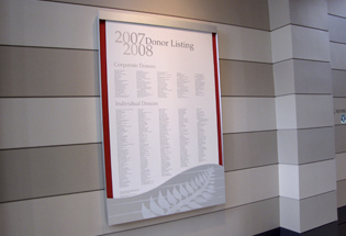
 When this distinguished museum needed to recognize their annual donors, they asked us to design a thoughtful, affordable donor recognition wall. Our task was to design, create and install a display that was of a caliber worthy of display in The Cedar Rapids Art Museum’s $10 million renovated, modern lobby. The recognition display needed to be relevant to the space and be easily and affordably updated every year.
We started by studying the space to incorporate existing architectural elements. Taking into consideration the metal finishes used throughout the space, the horizontal banding in the architecture as well as the neutral colors popped with bursts of cranberry, purple and charcoal, we designed and fabricated a recognition wall display that enhanced and spoke to the space. A permanent frame of sorts was created where the interior mounted print could be changed year after year. Corporate and individual donors are recognized in charcoal on a field of neutral tones that match the walls. With a band of cranberry background color showing from behind the print on either side, the color accents of the lobby are referenced. The horizontal stripes and fern pattern tonally represented on the aluminum fascia juxtapose the curve in the shape that draws your eye against all the linear elements of the space while speaking to the adjoining atrium.
This elegant, donor recognition wall display was clearly designed for the space and provides the Cedar Rapids Museum of Art a means of affordably updating their donor recognition on a yearly basis.

 A celebration of the many different donors and giving campaigns is reflected in the many different donor displays custom designed and fabricated by Presentations using their exclusive Rail Wall and Arreya Digital Signage products.
  The capital campaign donor wall was constructed by rolling aluminum to emulate cans of food, into an abstract mosaic that graces the large, 2-story lobby. Translucent photos were printed on concave pieces of aluminum and corporate donor logos were added to some of the larger pieces of rolled aluminum.
 The Wall of Hope donor wall is inspiring with custom artwork. Using a local artists renderings and donor signatures to catch the attention of the many visitors, volunteers and corporate donors that help in the busy packing area of the facility.
 As an added bonus, an interactive kiosk greets visitors at the entrance to the facility. It gives information about the outreach programs and meets LEED requirements.
