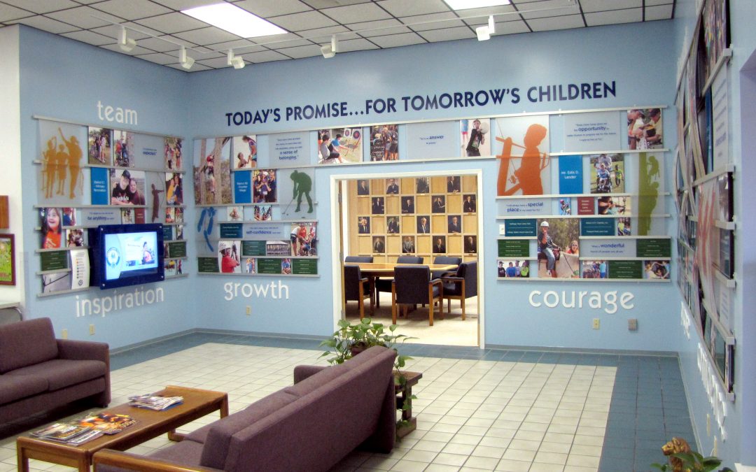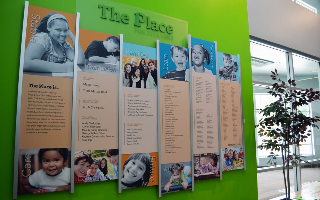
The new donor display is the perfect solution for “The Place for Everyone” the Boys and Girls Club outreach center.
As part of the Boys and Girls Club and Child Resource and Referral of Rochester Minnesota. In celebration of the generous donors, Presentations designed and fabricated a special recognition donor display from Presentations exclusive Rail Wall. Meeting all the needs for the client to easily add new donors, vibrant and branded for the entrance of the new space.
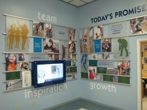
 Early discussions included space allocation and custom wall colors to confirm that donor recognition was not an afterthought, but a part of the building project. The result is a display that represents the client branding, greets visitor and honors the many donations. The 8 foot donor wall is a custom design to visually combine the goal of both places. In fact it is reflected in the amazing photos and changeable naming panels. With the bright, vibrant colors and happy children it is a visual reflection of the mission and vision of the new facility. Different giving levels are arranged by the size of the names on different panels. The panels can be changed in the Rail Wall, making it easy for donor panel updates and the addition of many new donations.

 A celebration of the many different donors and giving campaigns is reflected in the many different donor displays custom designed and fabricated by Presentations using their exclusive Rail Wall and Arreya Digital Signage products.
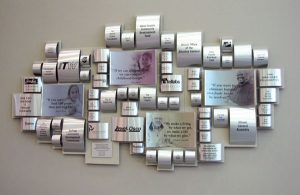
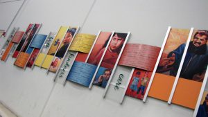
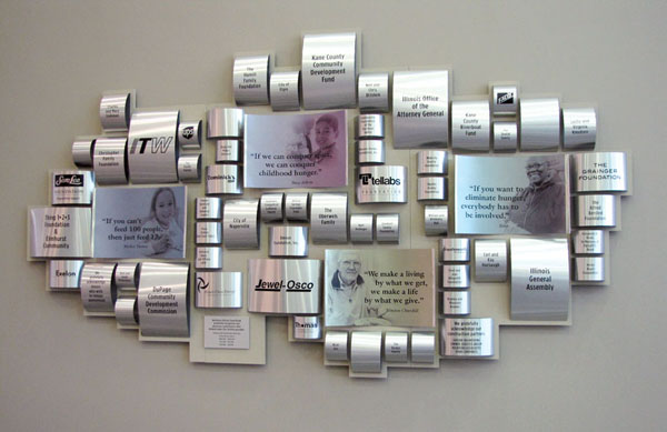
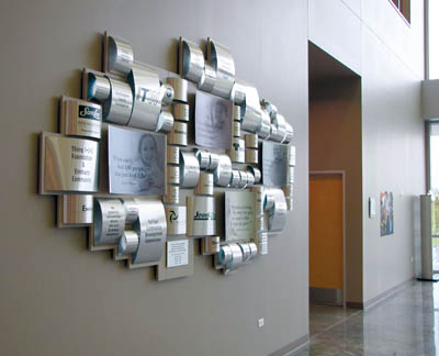
 The capital campaign donor wall was constructed by rolling aluminum to emulate cans of food, into an abstract mosaic that graces the large, 2-story lobby. Translucent photos were printed on concave pieces of aluminum and corporate donor logos were added to some of the larger pieces of rolled aluminum.
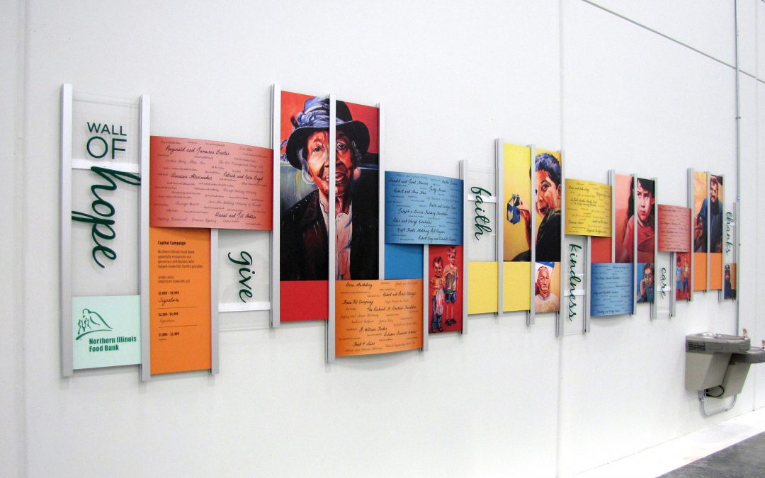
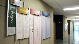
The 2 of the 3 other donor walls needed to be easily updated and Presentations, exclusive Rail Wall was the perfect choice. The Rail Wall donor walls are great for creating an updateable donor wall. New donor list panels are reprinted and slide in and out and the structure coordinates with the modern, industrial architecture of the space. The designs were developed and fabricated by Presentations to coordinate with the campaigns and differentiate between the annual giving campaigns and the capital campaign donor wall.
 The Wall of Hope donor wall is inspiring with custom artwork. Using a local artists renderings and donor signatures to catch the attention of the many visitors, volunteers and corporate donors that help in the busy packing area of the facility.
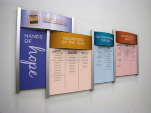
With the continued success of the facility, another Rail Wall was added to accommodate the many different types of donors. The design reflects the 2 other annual donor walls. The headers panels denote the different giving levels, while the panels are lists of the donors and corporate logos. Each year new panels are created to replace the old panels. Within minutes of installation donors were snapping photos of the new donor recognition display.
 As an added bonus, an interactive kiosk greets visitors at the entrance to the facility. It gives information about the outreach programs and meets LEED requirements.

Creating a new and inspiring donor recognition wall was priority for the Texas Lions Camp located in Kerrville, Texas. This amazing outdoor learning center provides the “Can Do” philosophy and improve self esteem for children with physical disabilities, Type 1 diabetes, and cancer. Because of the support from donors and volunteers TLC has been providing camping experiences at no charge, since 1949.
After making a connection with Presentations at the AFP Trade Show in Vancouver, TLC commissioned Presentations to concept, build, and install a donor wall. Initial brainstorming identified this donor display needed to be flexible, easily and cost effective to update, include a digital component, showcase the TLC story and inspire involvement.

TLC Donor Wall
An interactive section of the donor wall includes a touch screen digital display within the grid system to recognize lower level donors and invites guests to learn about activities, events and more. The digital component was a great solution to easily manage and recognize the other 23,846 donors which before couldn’t be effectively acknowledged. Developing a custom web based donor layout listing software was a key component because the 23,846 names is such a huge number to handle. Now the digital donor display allows any TLC staff member wireless access for updates on the fly keeping the display current and making updates a very easy and efficient task.

TLC Digital Donor Display
“TLC’s Board of Directors LOVE IT, a flawless execution of our plan was delivered by Presentations, and I cannot be more thrilled with our donor recognition wall”, said Stephen S. Mabry, CEO Texas Lions Camp.
Presentations is proud to have delivered a donor wall that truly speaks for TLC and that will inspire giving to continue for years to come.

 I
I n
n order to better position the Food Bank to meet the increasing need for years to come, NIFB launched a Capital Campaign “We are running out of space, but not out of hungry people” to build a new Food Distribution and Community Nutrition Center. The campaign was a success and The Food Bank opened the doors of their new facility.
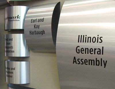
To recognize and thank the donors for their support, the Food Bank wanted a unique donor wall that fit the new open space of the lobby. The challenge was designing something that spoke to the food bank and their campaign, but fit the space. The creative process went from a logo wall using actual food cans to, a display of food cans, but the final design was geometric formation of cylinders to represent cans.
To also add a sense of impact, images and quotes were incorporated into the layout. The final design identifies four levels of giving, relates to the food bank, adds shape, color and reflection to the space.
The curved tin was also designed into the facilities wayfinding and room naming opportunities for donors to be recognized on.
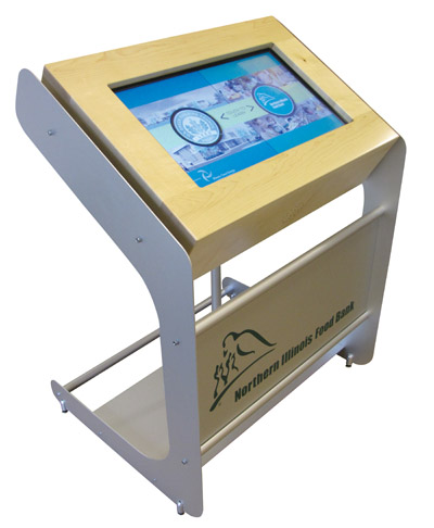
A touch screen kiosk was developed for the lobby which displays informational content about the food bank and is also an educational component about features of the building.
The result was a one-of-a-kind look and design the Food Bank was proud to showcase and share with the community it serves.


 Early discussions included space allocation and custom wall colors to confirm that donor recognition was not an afterthought, but a part of the building project. The result is a display that represents the client branding, greets visitor and honors the many donations. The 8 foot donor wall is a custom design to visually combine the goal of both places. In fact it is reflected in the amazing photos and changeable naming panels. With the bright, vibrant colors and happy children it is a visual reflection of the mission and vision of the new facility. Different giving levels are arranged by the size of the names on different panels. The panels can be changed in the Rail Wall, making it easy for donor panel updates and the addition of many new donations.