 I
I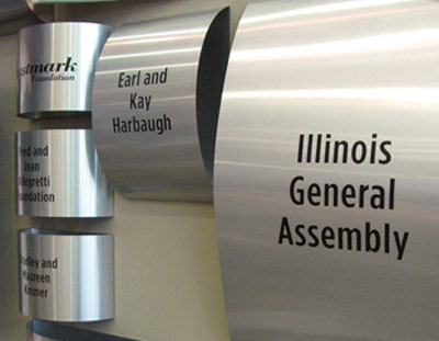 n
n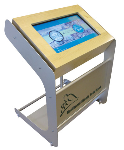 order to better position the Food Bank to meet the increasing need for years to come, NIFB launched a Capital Campaign “We are running out of space, but not out of hungry people” to build a new Food Distribution and Community Nutrition Center. The campaign was a success and The Food Bank opened the doors of their new facility.
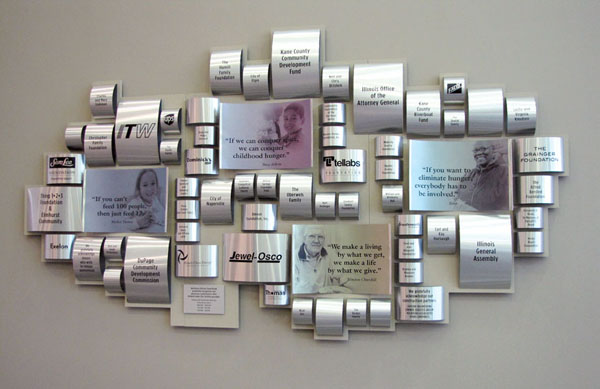
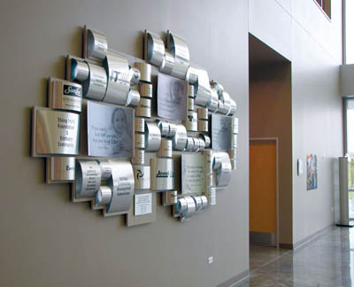
To recognize and thank the donors for their support, the Food Bank wanted a unique donor wall that fit the new open space of the lobby. The challenge was designing something that spoke to the food bank and their campaign, but fit the space. The creative process went from a logo wall using actual food cans to, a display of food cans, but the final design was geometric formation of cylinders to represent cans.
To also add a sense of impact, images and quotes were incorporated into the layout. The final design identifies four levels of giving, relates to the food bank, adds shape, color and reflection to the space.
The curved tin was also designed into the facilities wayfinding and room naming opportunities for donors to be recognized on.
A touch screen kiosk was developed for the lobby which displays informational content about the food bank and is also an educational component about features of the building.
The result was a one-of-a-kind look and design the Food Bank was proud to showcase and share with the community it serves.


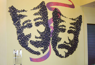
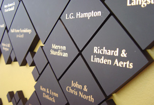
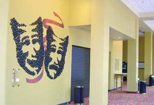
 Focusing on a renovation for the 100 year old theatre, the board wanted to update the existing, hard to read donor recognition panels and they wanted to include past and present donors. At the beginning of the renovation stage is when we were asked to scout a location for the new donor wall. Within moments of entering the new atrium lobbywe knew where the new donor panel should be located. A 30’ x 20’ wall next to the concession counter was the perfect spot to give the most visibility and recognize the generous donors. The beautiful floor length windows opposite the proposed donor wall allowed viewing from the street, even when the theatre was closed. Throughout the ornate theatre there are spectacular plaster theatrical masks, so when we picked the iconic tragedy/comedy theatrical masks for the overall design, it seemed a natural fit. We began by hand drawing the masks, and then through graphic art a pointillist art piece was designed. Composed of individual, black matt Plexiglas pieces with screened names, each size denotes giving level and a star represents prior status. Most importantly they are easy to read.
Because the Theatre Board wanted to make sure all of the arts were represented, a custom wallpaper ribbon with other theatre concerns was developed for the center of the donor wall. The tragedy/comedy faces were a focal point in the spacious new lobby.
Sadly, because of the devastating flood of June 2008, the Paramount Theatre is closed and the spectacular donor recognition wall no longer exists.

 I
I n
n order to better position the Food Bank to meet the increasing need for years to come, NIFB launched a Capital Campaign “We are running out of space, but not out of hungry people” to build a new Food Distribution and Community Nutrition Center. The campaign was a success and The Food Bank opened the doors of their new facility.
