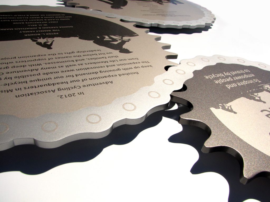
“To inspire and empower people to travel by bicycle” – That is the goal of the Adventure Cycling Association.

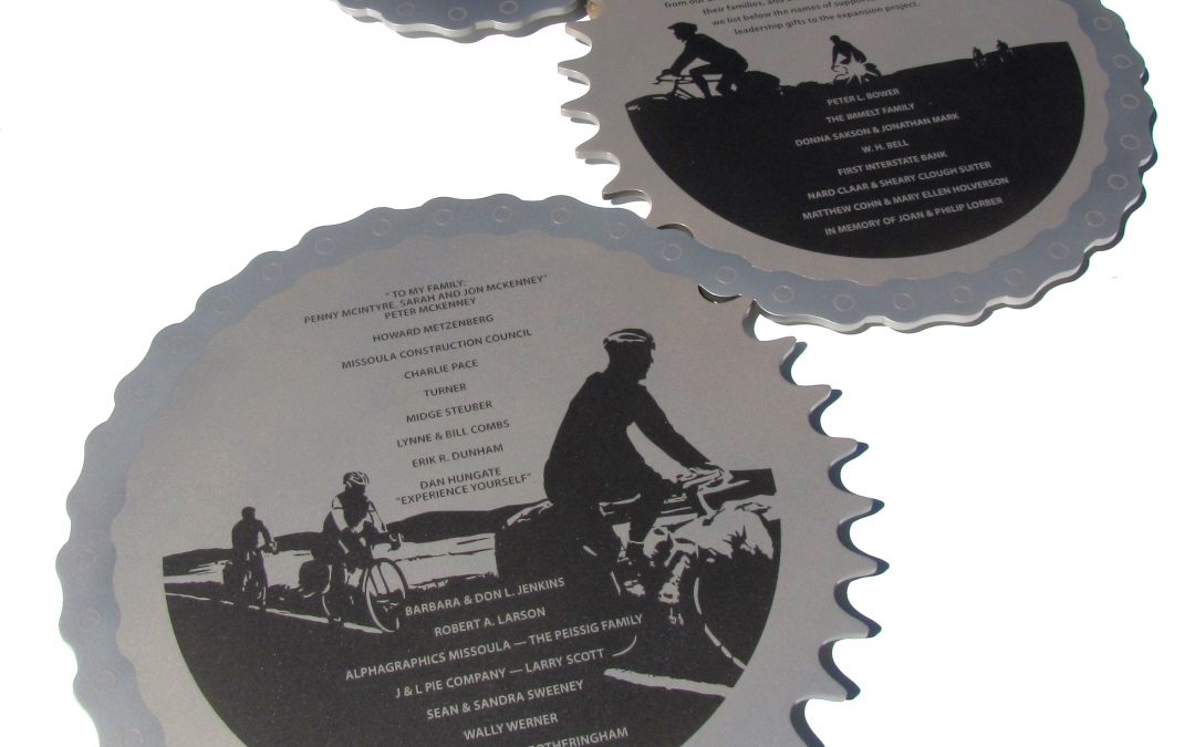
The Adventure Cycling Association was in need of a way to recognize their donors, something that would recognize everyone, but still spoke to who they are. With a short 1 month turn around, Presentations began looking at photos taken by the Adventure Cycling Association to inspire the one-of-a-kind outdoor donor panel. The images created from these photos became the background to a collage of gears and chains to represent how the organization is being driven by the generous contributions of their members.
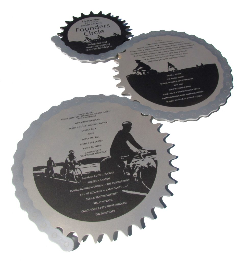 The original design is custom cut from aluminum and painted with metallic automotive paints for a durable outdoor finish. The design also allows for expansion with additional gears and chain. The piece was hung on an exterior wall at the Adventure Cycling Association headquarters in Missoula, Montana just in time for the July 6, 2012 Grand Opening of the new facilities.
Even though the Adventure Cycling Association was initially unsure about what they wanted in their custom recognition piece, Amanda F. Lipsey, the Development Director of the Adventure Cycling Association, stated once she saw the finished piece – “It is very us and fits us very well. I know the tight turnaround was difficult, but it has turned out beautifully and I’m so happy we can have it up for our opening.”


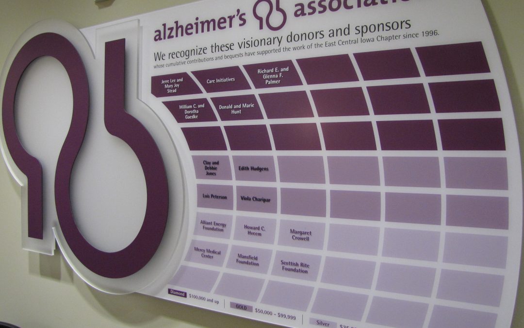
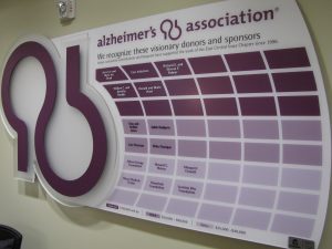
The East Central Iowa Chapter of the Alzheimer’s Association serves 19 counties in Iowa. In order to provide support and services to the estimated 16,000 people affected by Alzheimer’s in the area, the association relies on the generous donations of individuals, corporations, and organizations. The Alzheimer’s Association wanted to say thank you to those donors with a donor wall.
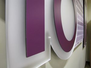
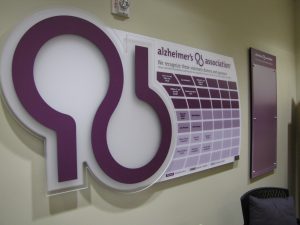
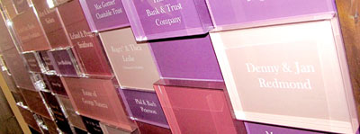
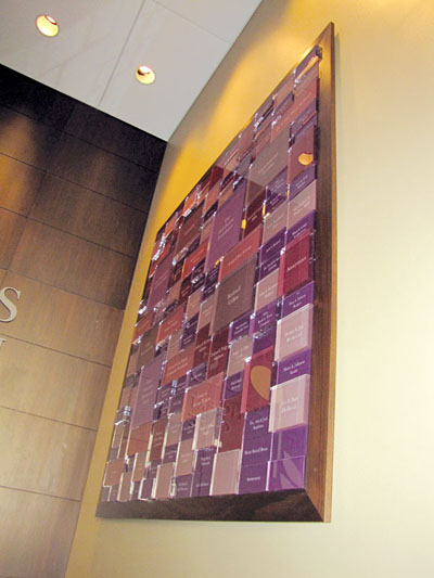
To keep the project within the budget and fit the wall space available for the project, Presentations’ solution was a custom five layer donor wall with a simple, but bold design. The frosted Plexiglas highlights the bold purple logo, while adding depth and layers to the piece. Differing shades of the same purple were used to show the various giving levels. The donor wall is completely updateable and names can be easily added at any time without removing the donor panel.
In addition, the Alzheimer’s Association wanted a changeable display designed to compliment the donor wall. A printed panel with a Plexiglas cover and removable standoff caps provides the association with a practical way to display additional information while completing the overall look of the wall.


 F
F o
o u
u n
n ded in April 1921 as the Cedar Rapids Symphony, Orchestra Iowa’s mission is to foster the enjoyment of, and support for, fine symphonic music through quality performances, education, and community involvement. Being one of the oldest symphony orchestras in the state of Iowa the Symphony Center can now continue its mission after being destroyed by the 2008 flood. This was all made possible by the success of the Opus Capital Campaign.
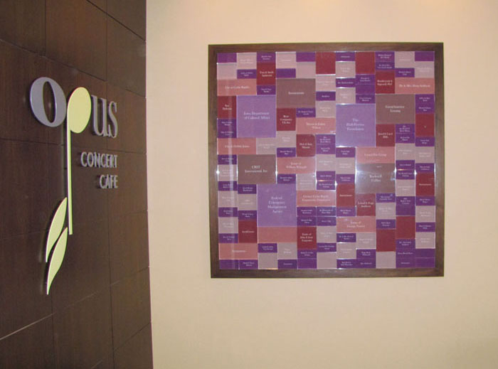
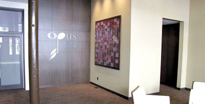
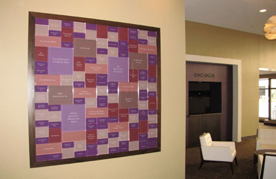
To recognize the great support Orchestra Iowa designated a main lobby wall to feature a display to celebrate its donors. The question was what to do in this modern new space. An art form on the wall was our solution. Influence came from artist Piet Mondrian for his geometric shapes and patterns. The idea was to create a modern abstract form incorporating the interior colors. But to really enhance the piece we turned it into a sculpture form by using four different depths of blocks, so when arranged together they create many shadows and reflections. This added great character to the donor wall because it initially gets viewed from the side as people enter so the shapes and depth do not get missed. The six foot square donor wall includes 140 named blocks with 6 giving levels denoted by color and size, hangs as a one piece unit and is framed to match the interior trim in the new space.
The result is a original art form that doubles as a donor wall but really attracts attention, can’t be missed and fits into the modern new space. This original design created for Orchestra Iowa will be a lasting thank you to all those who helped make the new center possible

 I
I n
n order to better position the Food Bank to meet the increasing need for years to come, NIFB launched a Capital Campaign “We are running out of space, but not out of hungry people” to build a new Food Distribution and Community Nutrition Center. The campaign was a success and The Food Bank opened the doors of their new facility.
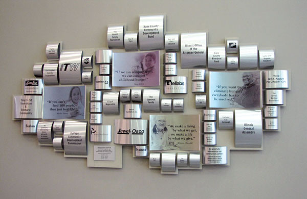
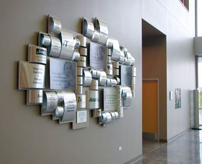
To recognize and thank the donors for their support, the Food Bank wanted a unique donor wall that fit the new open space of the lobby. The challenge was designing something that spoke to the food bank and their campaign, but fit the space. The creative process went from a logo wall using actual food cans to, a display of food cans, but the final design was geometric formation of cylinders to represent cans.
To also add a sense of impact, images and quotes were incorporated into the layout. The final design identifies four levels of giving, relates to the food bank, adds shape, color and reflection to the space.
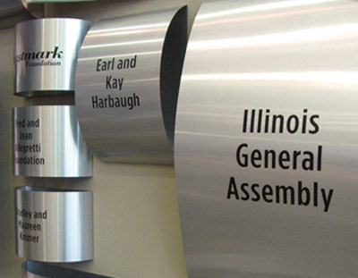
The curved tin was also designed into the facilities wayfinding and room naming opportunities for donors to be recognized on.
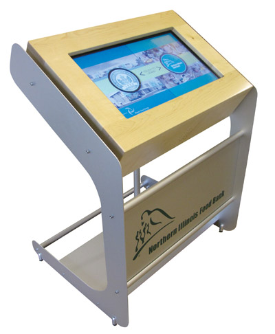
A touch screen kiosk was developed for the lobby which displays informational content about the food bank and is also an educational component about features of the building.
The result was a one-of-a-kind look and design the Food Bank was proud to showcase and share with the community it serves.


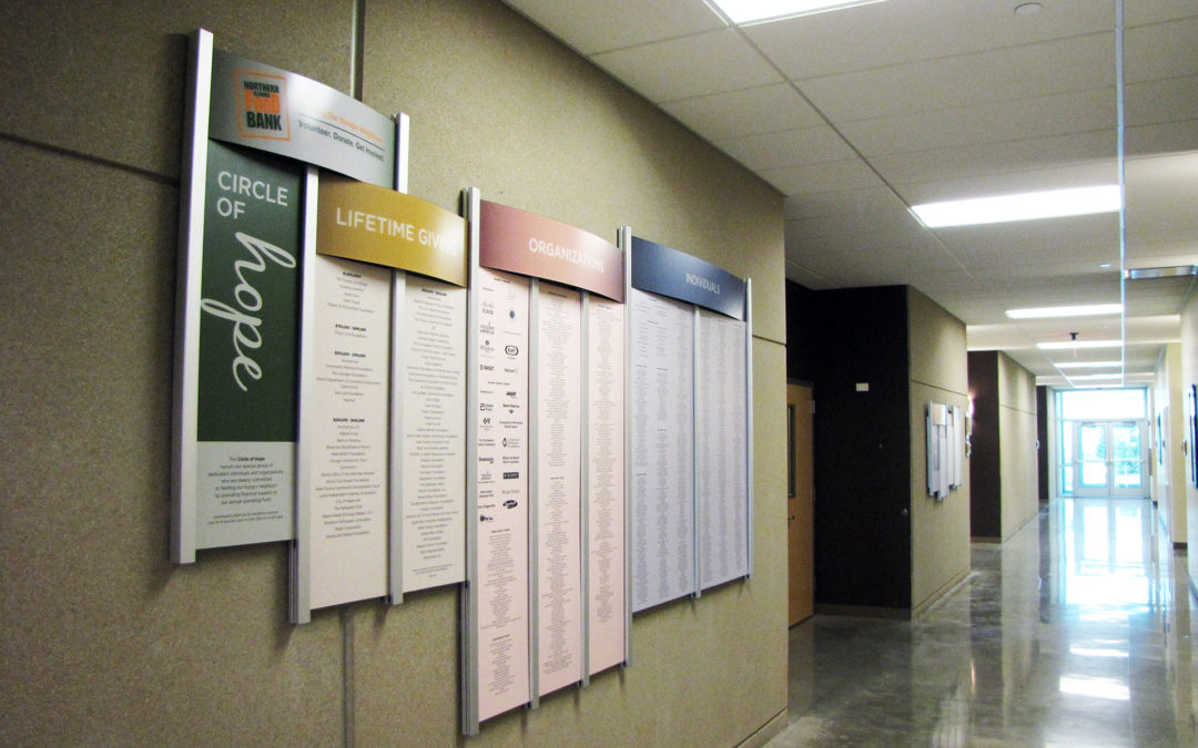
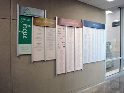
 Annual donor membership and volunteer support helps achieve the mission – to provide nutritious food to all those in need. This yearly support is now recognized on the custom donor display found in a main hallway of the food bank. Both the annual wall and the volunteer wall use Presentations Rail Wall System with color sections to distinguish categories. Yearly updates are easily made by inserting new prints into the grid columns.
The result is an attractive display of names which shows importance and thanks to those individuals making a difference.

 The original design is custom cut from aluminum and painted with metallic automotive paints for a durable outdoor finish. The design also allows for expansion with additional gears and chain. The piece was hung on an exterior wall at the Adventure Cycling Association headquarters in Missoula, Montana just in time for the July 6, 2012 Grand Opening of the new facilities.
