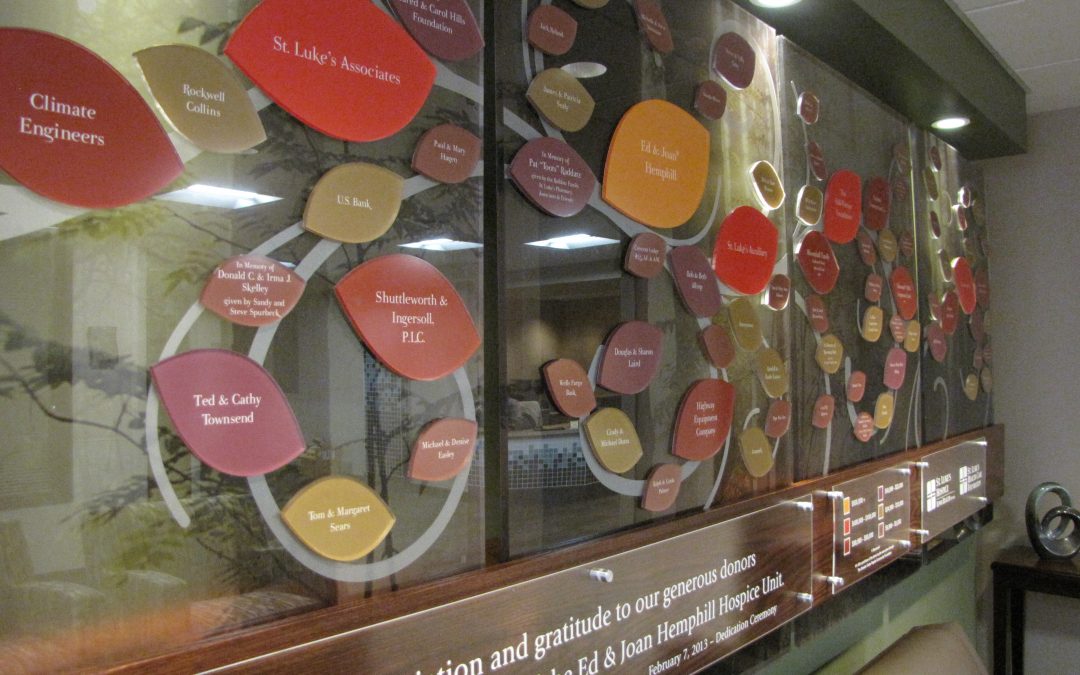
A creative twist on the traditional donor tree
Presentations’ custom design for the Hospital Hospice Care adds a soft and natural look to the space. Working seamlessly with the hospital team, the donor display brings to life the artful vision of this magical donor recognition wall.
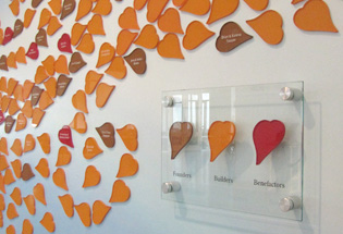
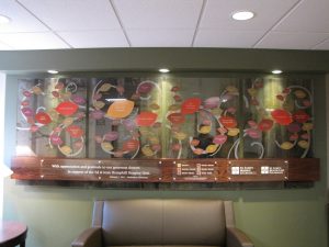 At first glance, you’re drawn into the beauty of the donor wall by the soothing earth tones of the individually cut donor leaves, and the whimsy of the etched swirling branches that seem to carry the donor leaves and flow through the air into the serene forest.
The donor tree is a perfect for the small space, which is at the entrance to the hospice unit, and a gathering area for visitors and families, but it also needed to tie into and add an artistic tone. It was only fitting, that the theme of the donor recognition wall, and inpatient hospice unit, embrace the seasons of life and change. 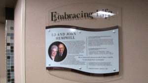
The donor tree leaves and back panels are made of translucent photo panels. Etched line art was added to each panel for a whimsical feeling and wood was used to tie it all together. Presentations went a step further and carried these materials throughout the hospice unit with nearly 20 room naming signs made of these same materials. Special hardware was used to ensure security throughout the busy hospital. Additionally, the key donor was recognized in a separate plaque telling their donor story and honoring their donation to the new Hospice Care facility. 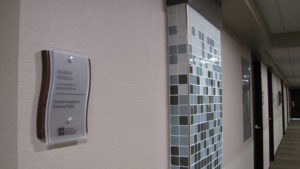
Our ongoing relationship with UnityPoint Healthcare has resulted in an array of visual displays throughout their network of hospitals, clinics and care centers. Our team works closely with the healthcare, marketing and foundation to create custom history displays, digital and static donor recognition, digital marketing, and wayfinding to fit each unique space, budget and mission.
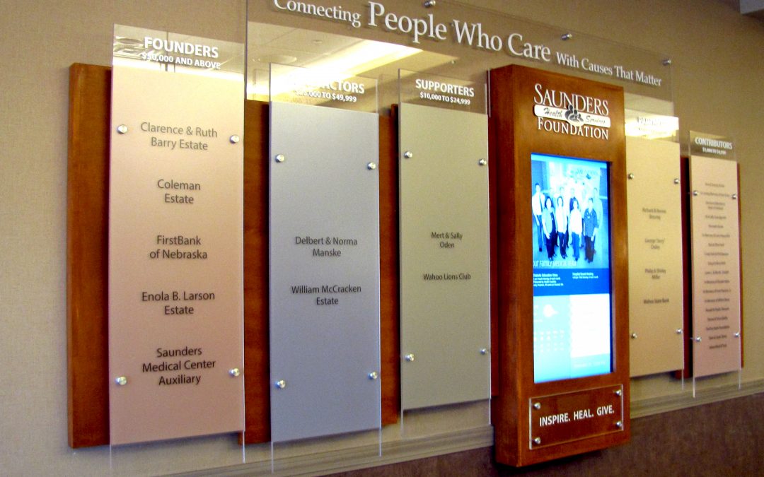
Saunders Medical Center, a brand new healthcare facility in Wahoo, Nebraska needed a way to acknowledge their donors, post upcoming events  and most importantly, encourage new donations. The answer was a digital donor wall with ARREYA digital signage software. Not unlike many waiting areas, Saunders had hung pictures and a television for visitors. Wanting to do more with the space and bring in more donations for the community hospital, management decided on an interactive digital donor wall that would engage visitors. Using the cloud-based ARREYA software, their off-site designer was able to add the digital content and PUSH it instantly. The hospital marketing director could then view the content on the monitor and relay to the designer over a cell phone what she wanted updated.
As stated by the interim CEO, Tyler Toline, “I believe being from a small facility that the price to value of the work Presentations has put up is perfect for our markets. We get the technology everyone enjoys along with the static recognition that some generations come to value. It is truly a great product that has been the talk of many conversations in our lobby. It has already generated multiple donations from people wanting their name on the board.”
ARREYA digital signage software is easy to use and reliable. Content can be done from anywhere through the cloud-based subscription and is instantly viewable. Interactive touchscreen is a basic part of the monthly subscription, so Saunders added pages for different donor campaigns, events, donor stories and biographies.
Saunders Medical Center combined the capital campaign donors with the other campaigns into this one elegant donor wall. No need to spend money on multiple donor walls. Everything is under “one roof” allowing for donor to view everything in one location.
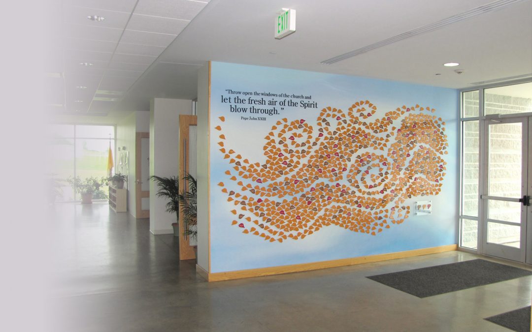
The custom donor tree is a special rendition on the traditional donor trees of past. No brass plates, but bright acrylic leaves each with a donor name fly across the custom wallpaper print. Our challenge was to create a donor recognition wall to fit the design of this new building and to showcase the church’s message.
Choosing the location for the donor wall was easy – a large front wall just as you enter the church with great lighting from the windows. 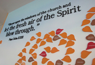 Because the church has a new modern feel and very open floor design we didn’t want to just showcase traditional catholic symbolism on this donor wall. So we researched Pope John XXIII, who he was and
 what he did. The spark to our design for this donor wall came from his quote “throw open the windows of the church and let the fresh air of the spirit blow through”. So our concept was to use this quote and to create a sense of the spirit blowing into the church – a perfect message allowing for multiple interpretations and a great tie into John XXIII Catholic Church.
With all the while walls in the church the donor wall needed to have some contrast, so we brought the outside in. We designed a custom background of a fresh blue sky with wispy clouds and printed this to wall paper and installed it over the entire wall. We chose the leaf as the shape for the recognition name plates since it is the natural object to blow in the wind and it’s a common donor recognition symbol. The custom acrylic cut leaves were whimsically arranged to show the motion of wind, as if the fresh air of the Spirit was blowing in. The fall colors complement the blue sky and bring some warmth into the white space. Each leaf is individually applied to the wall paper. A legend was included to identify the three campaigns by the leaf color. The structure of the content was that two campaigns were already complete but the building campaign would continue for years to come. The design included 900 leaves and initially only 300 named. This donor recognition wall is routinely updated by adding names to the leaves that were intentionally left blank.
Now when entering John XXII Catholic Church the donor wall is an impactful first impression and while it grabs attention it also celebrates involvement and it really gives people the feeling that they donated to something special.


Go PINK in your Donor Recognition
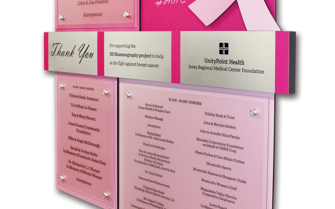
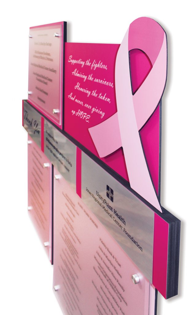
Presentations, Inc was recently tasked with creating a “pink wall” for a breast cancer donor recognition display by UnityPoint – Jones Regional Medical Center. The fundraiser was a one time campaign to update the cancer center with the latest technology in 3D mammography. Jones Regional Medical Center serves a rural population, so bringing awareness and technology to the small hospital is sure to be a positive addition to their services. The hospital’s campaign information stated that 1 in 8 women will suffer from breast cancer in their lifetime.
As an environmental graphic design consulting and fabrication company, Presentations has created many donor recognition displays for hospitals and nonprofit organizations over its 20 years, but this is the first of its kind. The campaign was targeted and short, but would help hundreds of women detect breast cancer before it becomes life-threatening.
Branded Yet Beautiful
Everybody knows that the pink ribbon is for breast cancer awareness, people wear pink shirts and athletic teams sport pink socks in October. It only makes sense that the donor recognition display would be shades of pink and be adorned with the symbolic pink ribbon. It is eye-catching and speaks to the audience that cares about the cause.
Custom design and fabrication services from Presentations ensured that the donor display tells the story, states the mission of breast cancer services and awareness, and expresses gratitude to the people who contributed to the new 3D mammography equipment.
The Possibilities are Endless
Donor recognition displays can be any shape, size or color, but the key is to make it mean something. A pink ribbon may state the mission of the organization all by itself, but displays for other organizations may need a more in-depth explanation. Mission statements, photos, colors and even interactive digital donor displays with sound and stories can be incorporated into your signage. There is no limit when you have your display custom designed and fabricated by a company that can create displays from start to finish.

 A celebration of the many different donors and giving campaigns is reflected in the many different donor displays custom designed and fabricated by Presentations using their exclusive Rail Wall and Arreya Digital Signage products.
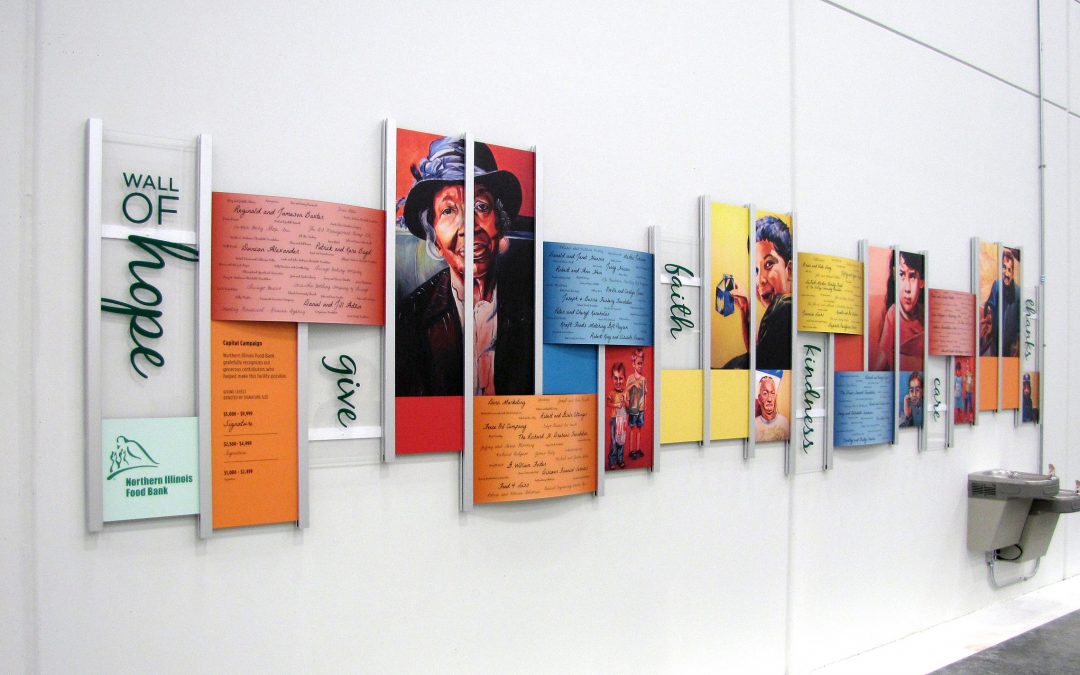
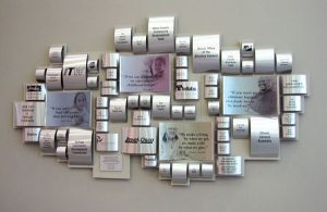
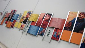
 The capital campaign donor wall was constructed by rolling aluminum to emulate cans of food, into an abstract mosaic that graces the large, 2-story lobby. Translucent photos were printed on concave pieces of aluminum and corporate donor logos were added to some of the larger pieces of rolled aluminum.
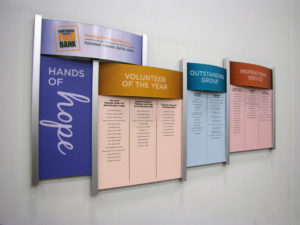
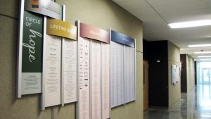
The 2 of the 3 other donor walls needed to be easily updated and Presentations, exclusive Rail Wall was the perfect choice. The Rail Wall donor walls are great for creating an updateable donor wall. New donor list panels are reprinted and slide in and out and the structure coordinates with the modern, industrial architecture of the space. The designs were developed and fabricated by Presentations to coordinate with the campaigns and differentiate between the annual giving campaigns and the capital campaign donor wall.
 The Wall of Hope donor wall is inspiring with custom artwork. Using a local artists renderings and donor signatures to catch the attention of the many visitors, volunteers and corporate donors that help in the busy packing area of the facility.
With the continued success of the facility, another Rail Wall was added to accommodate the many different types of donors. The design reflects the 2 other annual donor walls. The headers panels denote the different giving levels, while the panels are lists of the donors and corporate logos. Each year new panels are created to replace the old panels. Within minutes of installation donors were snapping photos of the new donor recognition display.
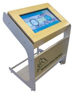
 As an added bonus, an interactive kiosk greets visitors at the entrance to the facility. It gives information about the outreach programs and meets LEED requirements.

 At first glance, you’re drawn into the beauty of the donor wall by the soothing earth tones of the individually cut donor leaves, and the whimsy of the etched swirling branches that seem to carry the donor leaves and flow through the air into the serene forest.




 Because the church has a new modern feel and very open floor design we didn’t want to just showcase traditional catholic symbolism on this donor wall. So we researched Pope John XXIII, who he was and
 what he did. The spark to our design for this donor wall came from his quote “throw open the windows of the church and let the fresh air of the spirit blow through”. So our concept was to use this quote and to create a sense of the spirit blowing into the church – a perfect message allowing for multiple interpretations and a great tie into John XXIII Catholic Church.